Visualizing data with AI
This feature is in beta and subject to change. Reach out to SquaredUp Support with any issues.
Have you ever found yourself sitting on a mountain of data, struggling to weave a narrative and unsure where to even begin? You're not alone. Most people building a dashboard for the first time spend more time staring at the chart settings than they do making sense of their actual data.
The good news is, thanks to SmartViz, dashboarder's block is a thing of the past.
How it works
When you turn on SmartViz, it looks at your data and automatically builds what it thinks is the best chart for it, picking the chart type, wiring up the axes, and choosing sensible groupings without you touching a single setting.
From there, you refine it by describing what you want changed, and SmartViz updates the chart to match, so you go from a rough first guess to the chart you actually meant with a few short prompts.
SquaredUp has two AI assistants in the tile editor. SmartAssist writes the query that fetches your data, and SmartViz turns that data into a chart. This article covers SmartViz. Both are in Beta.
Before you start
AI features must be enabled for your tenant. An admin can turn these on in Settings > AI.
For help writing the query itself, see SmartAssist. SmartViz picks up once your data is on screen.
How to use SmartViz
There are three ways to get a chart out of SmartViz, depending on where you’re starting from: a blank tile, an existing SmartViz chart, or a classic visualization you want to bring over.
Automatically generate a chart
Here a tile of alert counts by service goes straight from raw table to finished chart.
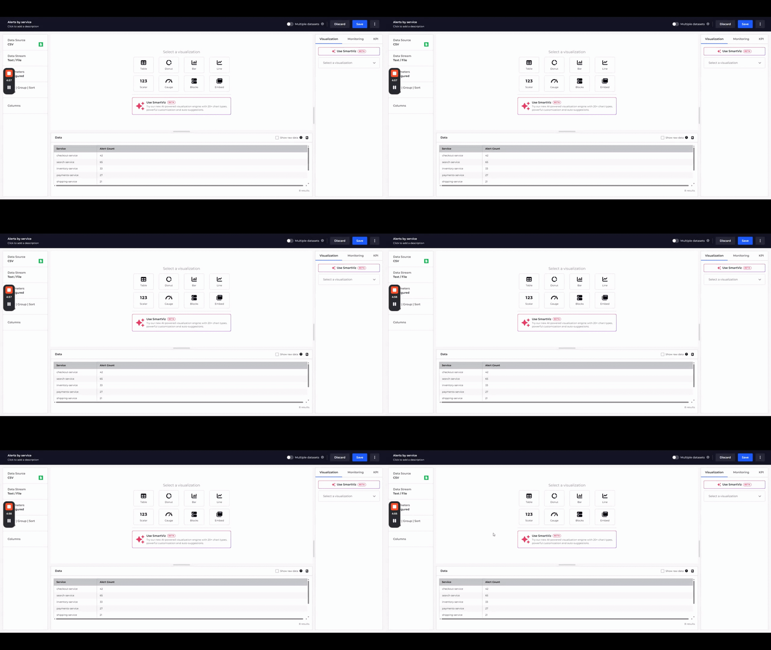
To add a new tile using SmartViz:
- Add a new data tile to your dashboard.
- Configure your data stream and shape your data in the tile editor.
- Click Use SmartViz when prompted to select a visualization chart type. The best chart type and settings are configured based on the current shape of the data.
- Review the output, accept it as-is, or continue shaping it with a prompt.
- Click Save when you’re happy with the result.
Edit a chart through prompts
Here a few short prompts take one bar chart through several shapes, ending with a color rule that flags any service above 50 alerts.
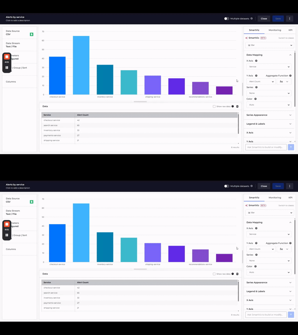
To edit an existing SmartViz chart:
- Open a tile with an existing SmartViz chart.
- Type what you want into the message box, for example “change this to a line graph”, “color the bars by team”, or “hide the legend”.Note
Prompts shape the chart itself. To change which rows reach it, use the Filter | Group | Sort step in the tile editor before prompting.
- Review the result. SmartViz applies it to your existing chart rather than starting over, and logs it as a new step in the conversation.
- Hover an earlier step to preview it, then click its reset icon to roll back if a change doesn’t work out, or use the Data Mapping section below the conversation to adjust something by hand instead.
- Click Save when you’re happy with the result.
Convert a classic chart to SmartViz
Here a classic stacked bar of deployments by team is rebuilt as a SmartViz chart, keeping its axes, grouping, and colors.
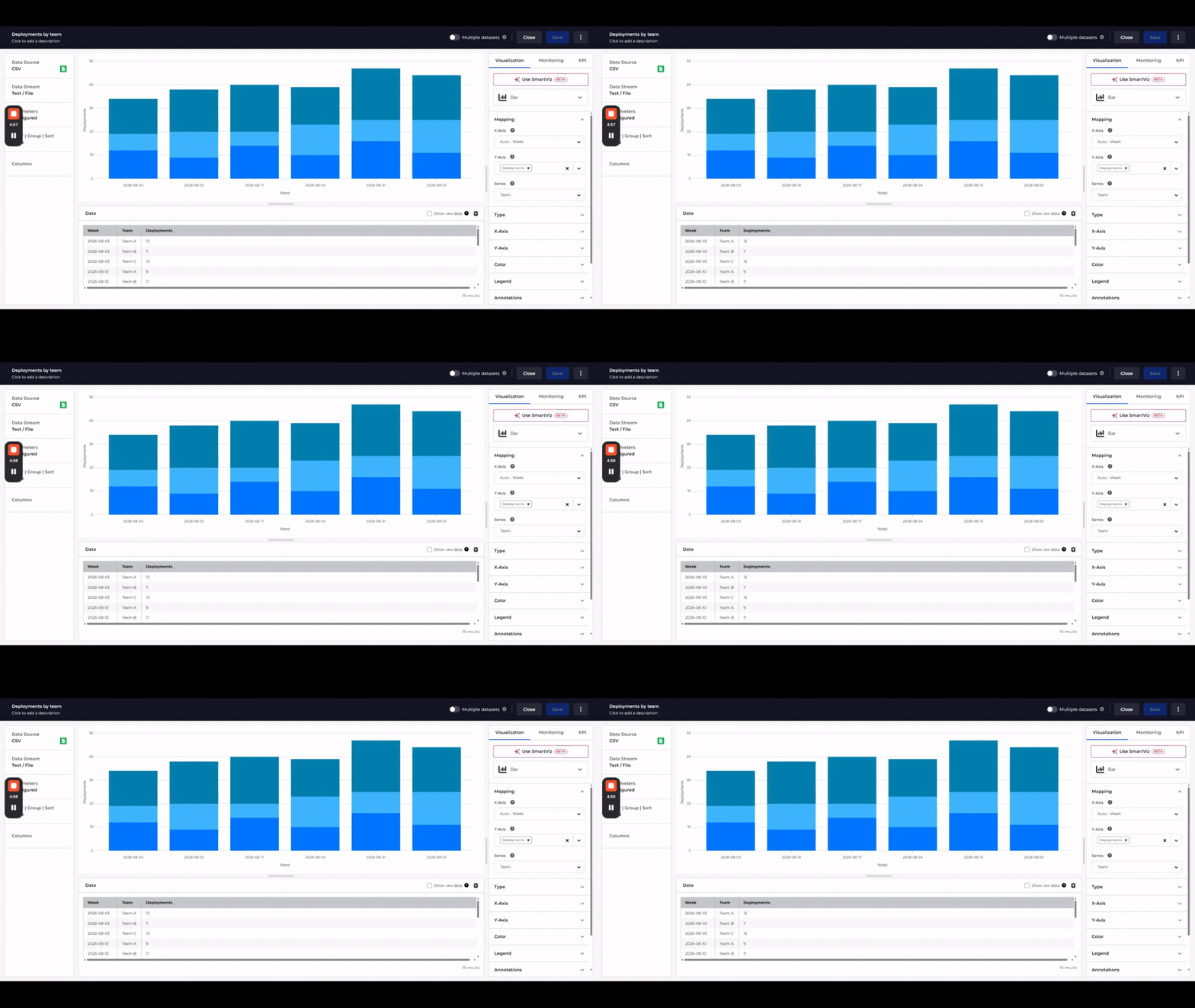
To convert a classic visualization:
- Open a tile that already has a classic visualization.
- Click Use SmartViz. It reads your existing configuration, including the axes, grouping, and colors, and rebuilds it as a SmartViz chart.
- Keep prompting or edit the mapping by hand, it behaves like any other SmartViz chart from here.
- Click Save when you’re happy with the result.
Tips to get a good result
- Load real data first: SmartViz shapes the chart around the columns your data stream returns, so a representative dataset gets you a far better first suggestion than an empty one.
- SmartViz reads your columns, not your rows: “make anything over 50 red” works because you supplied the threshold. “Show me the top 5” doesn’t.
- Timeframe belongs to the tile, not the prompt: asking for “the last 7 days” changes nothing. Set the timeframe on the tile, and SmartViz charts whatever comes back.
- Describe the result, not the setting: “sorted bar, highest first”, “split by team”, “breakdown by environment” and “show the trend” all land, because they name an outcome rather than a control to toggle.
- Change one thing at a time: each prompt rebuilds the whole chart with only your requested change applied, so short follow-ups stack up rather than starting over. Bundle several changes into one prompt and some get dropped.
- Experiment freely: every step is reversible, so try the odd idea and hover back through the conversation to compare.
Prompt examples
Every prompt below was run against SmartViz and produced the chart listed beside it. Start from the one closest to what you want to see, then swap in your own column names.
Chart prompts
These prompts set the chart type. SmartViz reads the columns in your data stream and decides for itself which one belongs on each axis.
Refinement prompts
These prompts adjust a chart you already have. Each one changes the single thing you asked for and leaves the rest of the chart as it was.