Building a dashboard
Dashboards are where your data comes to life in SquaredUp. They provide a single pane of glass view that brings together data from across your tools, systems, and services.
Through dashboards, raw data becomes actionable insights. With just a glance, you can understand the health, performance, and activity of the services you care about most, empowering fast decisions and confident operations.
This article introduces the core capabilities of dashboards in SquaredUp and walks you through creating a simple but valuable Release Status dashboard. You’ll end with a practical, working example and the skills to create dashboards of your own, as you continue your journey toward operational intelligence.
See Dashboards for a deeper dive, as well as help with configuration and settings.
What can dashboards do?
Dashboards are flexible, customizable pages in your workspace, where you assemble tiles to visualize and contextualize your data. They’re designed to help you tell a story; whether you’re monitoring systems health, tracking delivery performance, or correlating signals from multiple systems.
Dashboards can be used to:
- Surface real-time metrics, KPIs, and statuses
- Bring together data from multiple tools side-by-side
- Embed links, tools, and external content for seamless workflows
- RollUp the health status of underlying objects
- Provide structure and narrative context through text and imagery
Building your first dashboard
The tutorials carries directly on from adding your first data source.
In this tutorial, you’ll be walked through create your very first dashboard - a Release Status dashboard that gives you a useful overview of how your builds are progressing.
This example uses the Sample Data data source for convenience, but the principles and skills you're taught will translate to any other data source you choose.
1. Add a dashboard to your workspace
The first step to a building a dashboard is adding one to your workspace - which is as easy as a couple of clicks.
- Navigate to workspace you want to add the dashboard.
- Click. Add dashboard next to Dashboards in the left-hand pane.
- If this is the first dashboard in the workspace then it automatically opens, else select the New Dashboard form the left-hand pane to open it.
- Click the dashboard title at the top of the page and name it Release Status.
- Click Done.
Voilà! You now have your first dashboard in SquaredUp 🎉
Although it's looking rather empty at the moment... let's fix that by adding some tiles.
2. Add a data tile to your dashboard
There are several types of tiles that can be added to a dashboard: Data, Image, Text and Embed. Each of these add their unique value, and you'll use a mix of them when building out your dashboards.
For now, we'll focus on the most important tile type, the data tile, as this is the key to unlocking your dashboarding potential.
- Navigate to dashboard you want to add a tile to, for example My First Dashboard.
- Click the Edit button at the top of the dashboard to enter editing mode.
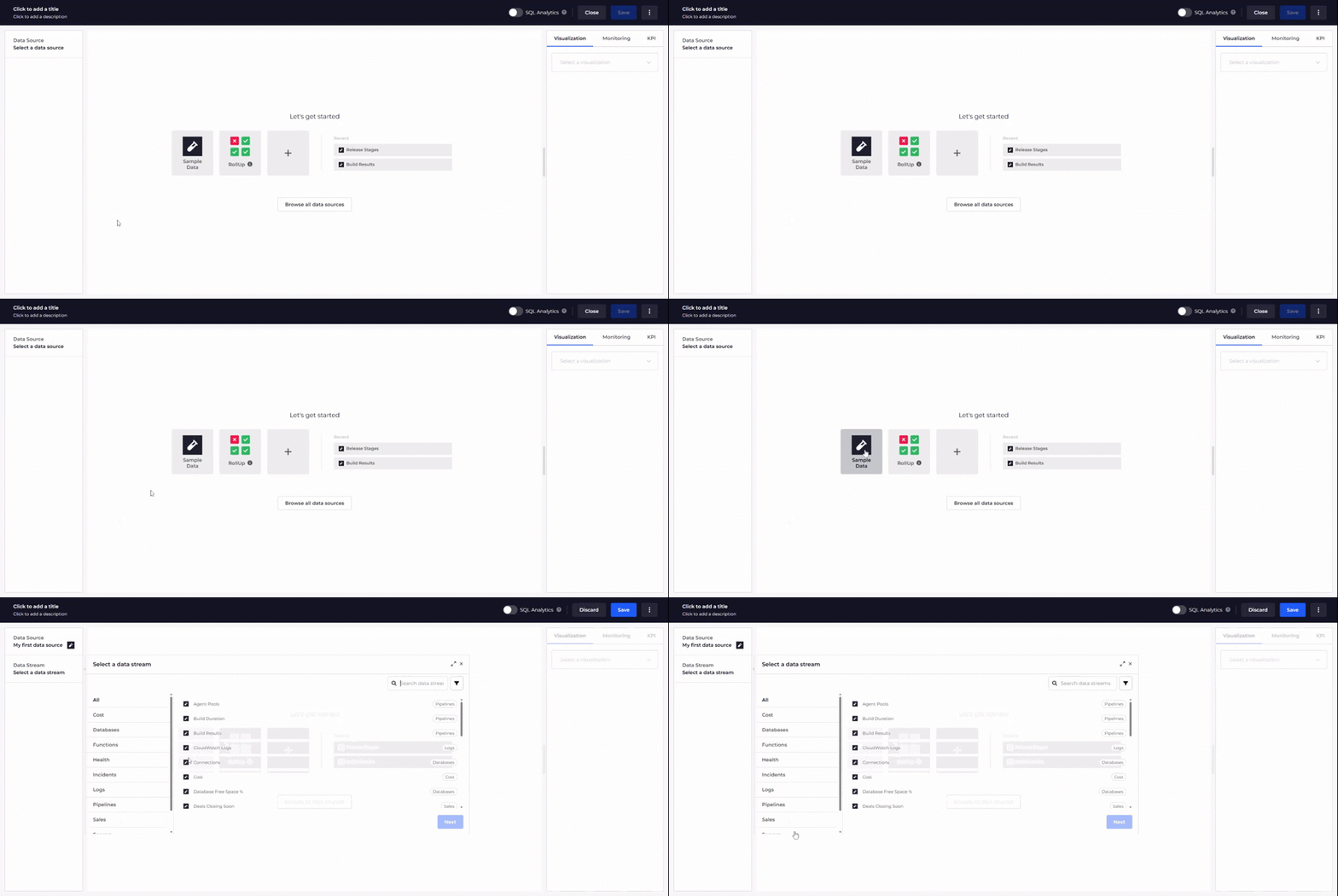
- Click a square to add an empty tile and the select select the Data option to open the Tile Editor.
3. Return data to the Tile Editor
To return data to your tile, you must select the data source of where that data is located, the data stream that returns that data, and the objects containing the data you want.
Note: In this tutorial we'll stick to non-configurable data streams that immediately return data, but be aware that some data streams are configurable and allow / require additional parameters to be supplied.
- In the tile editor, do the following:
- Select Click to add a title at the top of the editor and enter Release Status Dev.
- Select the Sample Data plugin from the list of data sources.
- Select Release Stages from the Select a data stream tab and click Next.
- Select Dev CodePipeline from the Select objects tab and click Done.

And just like that you have a data tile ready to be saved to your dashboard! But before we do lets take a minute to explore what we've just done and to make some finishing touches.
4. Configure a visualization
The raw data returned to the Tile Editor is shown in a table in the Data section below the visualization. From here, the next step is to decide which visualization best fits the data you are working with.
In this case, the data includes a State column. This is useful because it allows the visualization to react to the health or status of each object. Because of this, we will use the Blocks visualization by selecting it from the Visualization tab in the right-hand panel.
After selecting the visualization, you will notice that the State column been automatically selected to map the health state of each object, immediately giving us the result we wanted.
This visualization works great right out of the box, but lets add a finishing touch before saving the tile to your dashboard:
- In the Mapping section of the Visualizations tab, select Created from the Sublabel field. The timestamp of the build displays below the build number.
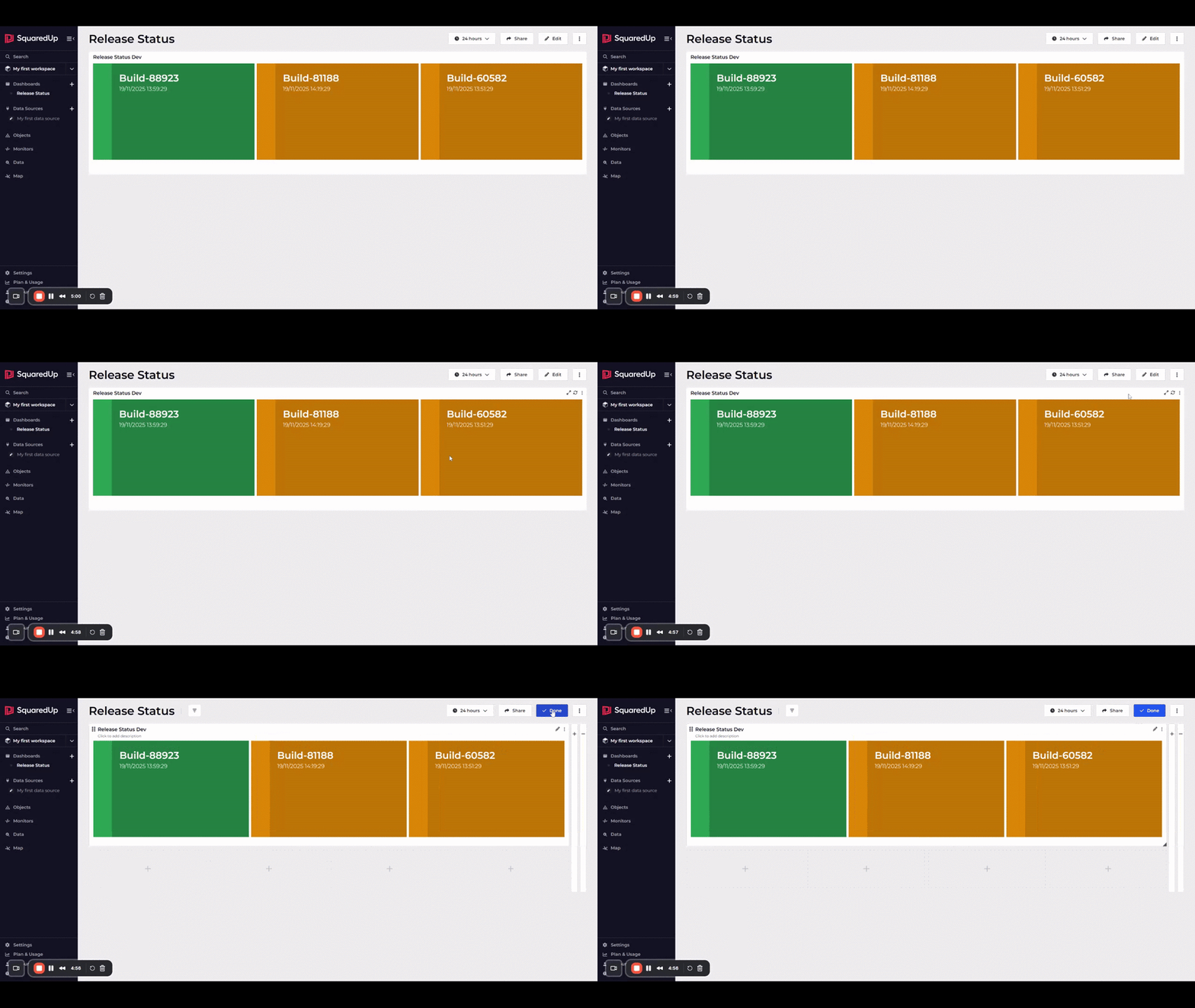
- Click Save on the toolbar. The Tile Editor closes and your tile displays on the your dashboard.
- Click Done to finish editing the dashboard and return to viewing mode.
And just like that, your first dashboard now displays beautiful data insights! 😎 We can now easily see a list of our development builds, along with their timestamps and health status.
5. Create more tiles!
One tile is nice, but there's plenty more space on that dashboard to include more juicy insights. Before continuing to the next steps, finish up your dashboard by doing the following to recreate the tiles in the screenshot under Building your first dashboard.
Don't worry if you get stuck, as you can choose to follow along with the video below.
Here's a list of things you must do:
- Start by repeating sections 2 to 4, except this time select the
Prod CodePipelineobject in step 5 of returning data to the tile editor. - Add a new
Build Results Devtile that:- Uses the Build Results data stream from the Sample Data plugin.
- Has the Dev CodePipeline object selected.
- Uses a Table visualization with Toggle visibility set to off for the Build Job column.
- Add a new
Build Results Prodtile that:- Uses the Build Results data stream from the Sample Data plugin.
- Has the Prod CodePipeline object selected.
- Uses a Table visualization with Toggle visibility set to off for the Build Job column.
- Arrange the dashboard layout to match the screenshot. To do so:
- Click Edit on the dashboard toolbar to enter edit mode.
- Resize the tiles as necessary by clicking and dragging the bottom-right corner.
- Move the tiles by clicking and dragging the top-left corner.

Next Steps
Now that you know the basics of building dashboards, you're ready start getting creative and learning how to leverage SquaredUp's more powerful capabilities. Take a moment to learn about different tile types for inspiration on what else you can add to your dashboards.
Monitoring tiles
The next step on your journey is to learn how to monitor a tile, so that you can track critical values, detect anomalies, and receive alerts when certain conditions occur. This also enables access to RollUp, which provides a high-level, visual summary of health across your environment.