Visualization settings

When configuring Data Tiles you're given various visualization styles to choose from depending on the data available. The following information describes the configuration options for each visualization type.

Table settings

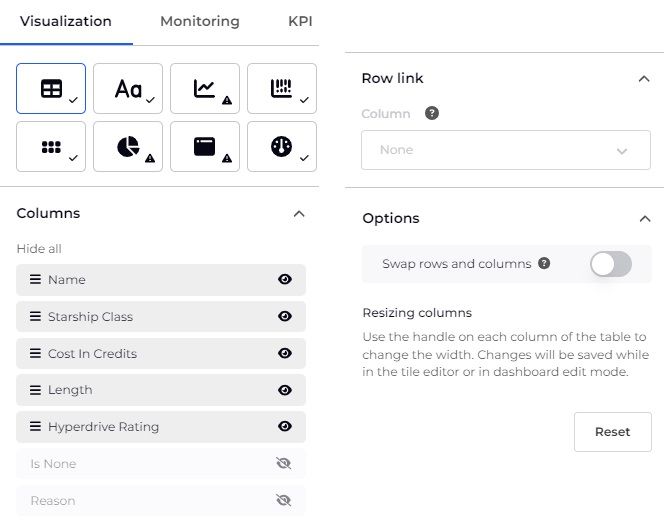
Table visualization settings

Columns

Setting
Description
Rename
Click on the column name in the Configuration panel and type to rename it.
Sort order
Click and drag a column name to change their order.
Hide/show
Click on the Toggle visibility icon
to hide / show a column.
Row Link
Hyperlinks each row in the table to the URL in the selected column.
Resizing columns
On the table preview hover between column names and use the handle to change the width. Changes will be saved while in the tile editor or in dashboard edit mode.

Setting
Description
Column
Select a column of type Url from this field to hyperlink the entire table row to that column URL's destination.

Options

Setting
Description
Swap rows and columns
Transpose the table to show the headings as the left-hand column. Particularly useful for single row tables.
Reset
Click to revert any changes you have made.

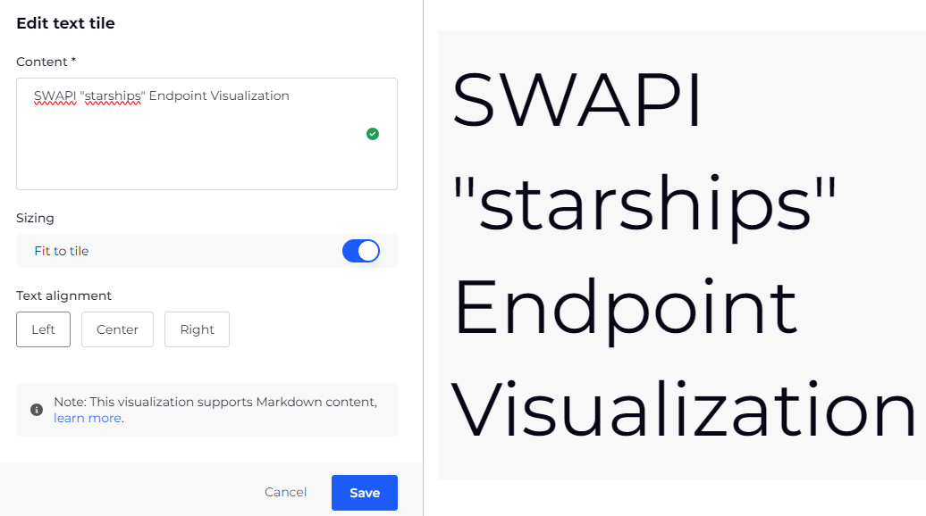
Scalar settings

Cover image

Mapping

Setting
Description
Value
Select a column to use for the value shown in the tile.
Show formatted value
This shows a simplified value. Toggle to Off to show the raw value. (On by default).

Label

Setting
Description
Text
Enter some label text to display for the scalar.
Position
Select where to display the label Text. Choose from:
  • Top
  • Bottom
  • Left
  • Right

Options

Setting
Description
Format value
Toggle whether the scalar shows the formatted string with units, or the raw value. By default this is set to on.
Manual size
Toggle whether to manually size the visualization. When enabled, use the slider to select a size. By default this is set to off.
Reset
Click to revert any changes you have made.

Line graph settings

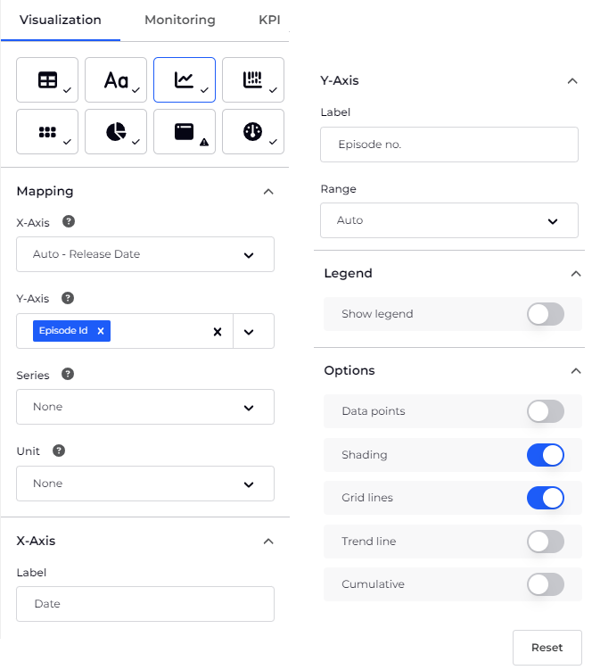
Line graph visualization settings

Mapping

Setting
Description
X-axis
Choose which data to show on the x-axis. Auto <column> shows the column which was selected automatically for you, usually a time field for the x-axis.
Y-axis
Choose which data to show on the y-axis. Auto <column> shows the column which was selected automatically for you, usually a numerical field for the y-axis.
Series
Choose how the stack is split into segments, usually a label or a string.
Unit
Select the column that you want to use for the unit label.

X-Axis

Setting
Description
Label
Allows you to override the default and enter a label, for example Date or Time.

Y-Axis

Setting
Description
Label
Allows you to override the default and enter a label, for example Tickets or ms.
Range
Auto - graph is fitted to the data automatically

Percentage - shows 0-100

Fit to data from zero - shows from 0 to the data maximum

Custom - allows you to specify the min and max

Legend

Setting
Description
Show legend
Toggle whether to display a colored legend for each series of data in the graph. Enabling the toggle displays the Legend position field below.
Position
Select where the legend is displayed in relation to the graph. This field is only visible when the Show legend toggle is enabled.

Options

Setting
Description
Data points
This shows where the data points are on the line. Useful to identify missing points, or detail for changing data.
Shading
Adds shading below each line.
Grid lines
Adds a horizontal line to each y-axis increment, spanning the x-axis.
Cumulative
Displays the line graph as cumulative. For example, when showing a cumulative cost over time, based on daily data points.
Trend line
Adds a line indicating the tendency of the data points, calculated using linear regression.

Bar chart settings

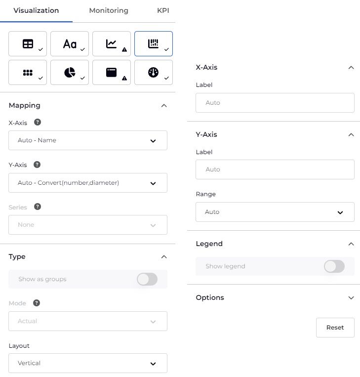
Bar chart visualization settings

Mapping

Setting
Description
X-Axis
Choose which data to show on the x-axis. Auto <column> shows the column which was selected automatically for you, usually a time field for the x-axis.
Y-Axis
Choose which data to show on the y-axis. Auto <column> shows the column which was selected automatically for you, usually a numerical field for the y-axis.
Series
Select the column used to split the x-axis values into series.

Type

Setting
Description
Show as groups
Toggle whether to display the Series as grouped bars. This option is only enabled when a Series is selected.
Mode
Percentage mode displays a series as a percentage of the overall bar, only available when a Series is selected.
Layout
Vertical or horizontal.

X-Axis

Setting
Description
Label
Allows you to override the default and enter a label, for example Date or Time.

Y-Axis

Setting
Description
Label
Allows you to override the default and enter a label, for example Tickets or ms.
Range
Auto - graph is fitted to the data automatically

Percentage - shows 0-100

Fit to data from zero - shows from 0 to the data maximum

Custom - allows you to specify the min and max

Legend

Setting
Description
Show legend
Toggle whether to display a colored legend for each series of data in the graph. Enabling the toggle displays the Legend position field below.
Position
Select where the legend is displayed in relation to the graph. This field is only visible when the Show legend toggle is enabled.

Options

Setting
Description
Grid lines
Select whether to include grid lines.
Annotation
Display an annotation showing the value for each series.
Reset
Click to revert any changes you have made.

Custom palette

It is possible to use custom colors for this visualization by creating a custom palette. Custom palettes can be declared as either an array or an object as follows:

  • Array: Select the colors based on the order of the data (for example, the first series is the first color).
    "palette": ["red", "#abcdef", "green"]
  • Object: Select colors based on the series label.
    "palette": { "EC2": "red", "Lambda": "#abcdef", "CloudWatch": "blue" }

Blocks settings

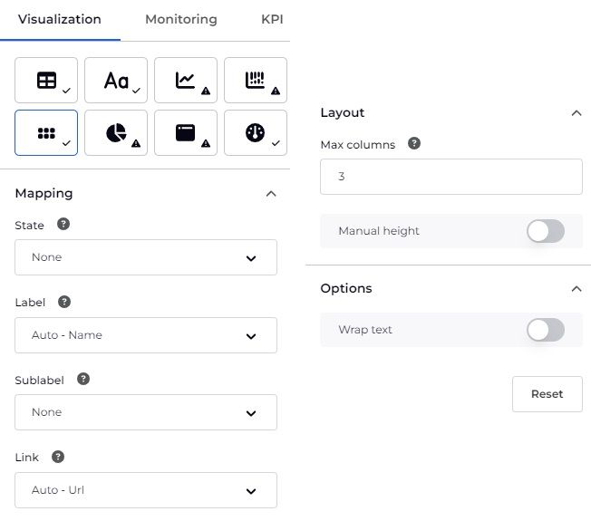
Blocks visualization settings

Mapping

Setting
Description
State
Select the column that you want to use for the state color of each block. Available options will vary depending on the data stream that you have selected. By default, the State column is automatically selected.
Label
Choose the label for the block.
Sublabel
Choose the sublabel to be shown beneath the main block label.
Link
Select the column that you want to use for the link of each block. Available options will vary depending on the data stream that you have selected.

Layout

Setting
Description
Max columns
Set the number of columns the blocks are displayed in.
Manual height
Select this to be able to resize the blocks, larger or smaller.

Options

Setting
Description
Wrap text
Select to wrap the block text onto a new line if it overflows the container.
Reset
Click to revert any changes you have made.

Donut settings

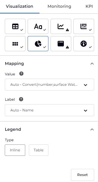
Donut visualization settings

Mapping

Setting
Description
Value
Choose the column to use for the value for each segment.
Label
Choose the label for each segment.

Legend

Setting
Description
Legend
Select how the donut labels are displayed. Choose from:
  • Inline: The labels are attached to the corresponding donut segment. This is the default style.
  • Table: The labels are displayed adjacent to the donut.
Legend Position
Select where the donut labels are displayed. This option is only visible when Table is selected from the Legend field.

Custom palette

It is possible to use custom colors for this visualization by creating a custom palette. Custom palettes can be declared as either an array or an object as follows:

  • Array: Select the colors based on the order of the data (for example, the first series is the first color).
    "palette": ["red", "#abcdef", "green"]
  • Object: Select colors based on the series label.
    "palette": { "EC2": "red", "Lambda": "#abcdef", "CloudWatch": "blue" }

Embed settings

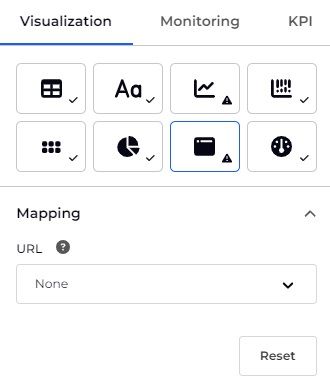
Embed visualization settings
The Embed visualization will embed a web page using a returned URL, when only one URL is returned.

For troubleshooting embedded websites see Why isn't my site showing?

Mapping

This allows you to select the column which you wish to use for the embedded URL.

Gauge settings

The Gauge visualization shows a single value, often a percentage, in relation to minimum and maximum values. Monitoring can be added so the gauge color changes based on your configured parameters.
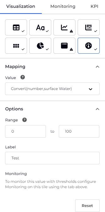
Gauge visualization settings
This short one minute video shows how to configure the gauge visualization:

Mapping

Setting
Description
Value
Choose which column or count to use as the value for the gauge. Auto <column> shows the column which was selected automatically for you.

Options

Setting
Description
Range
Specify the min and max of the gauge.
Label
Add a label to be shown beneath the gauge.
Monitoring
You can configure Monitoring (from the Monitoring tab) and then the colors configured for the conditions will show on the gauge. Check that the Data chosen in the Visualization (e.g. count) and the Value (and Column where applicable) that you are Monitoring (e.g. count) are as intended.
Reset
Click to revert any changes you have made.

Was this article helpful?


Have more questions or facing an issue?